d Artwork Guidelines & Templates for Printing - Where The Trade Buys
Loading...
Artwork2020-09-17T12:50:02+08:00

Providing your own artwork

When providing your own artwork for printing, please follow our guidelines below.

Preparing your artwork to the correct specs will allow you to order your printing without any interruptions to the printing process.  If you need a little help, then we can offer an artwork Check, Fix & Minor Edit from only $29, which gives you an email proof to check and approve before we print.

Layout

Printing Artwork Guidelines

Need a little help?

Artwork Edit Price

If you need a small fix to your artwork, we offer an artwork Check, Fix & Minor Edit from only $29. This gives you one round of minor revisions and one email proof to check and approve before we print.  We can easily edit the content, layout, colour format, resolution, and fonts if required.  If your request needs more than a small fix, we will provide an upfront set price quote.

Business Card Design

If your artwork needs a bit of a refresh, then talk to us about design and branding. Whether you need a small update or a brand overhaul, we provide a full in-house Australian service that will ensure your printing has the full effect.

General Artwork Guidelines

Basic Artwork Guidelines2020-09-17T12:50:55+08:00

Artwork Guide

Get the best start on your artwork by downloading one of our artwork templates, and following these guidelines.

  • Size, Bleed and Margins

    Please ensure your artwork has the exact size of your printing product.  A bleed of 3mm must be added to every side, and we recommend a 3mm margin inside from the edge. Trimming can shift slightly in any direction, so be smart in how you prepare artwork near the trim line.

    Note about bleeds in Photoshop.
  • File FormatAdobe Acrobat Template

    PDF is the preferred file format for supplying artwork.  You may use your preferred program to create artwork, as long as the program can export a final PDF suitable for printing.  We recommend using Adobe Creative Suite, and our blank templates with the correct specs.

  • Colour Format

    Use a CMYK colour format in your artwork. If your artwork contains RGB colour, it will be automatically converted to CMYK which sometimes produces unexpected results.

  • Resolution

    Use vector artwork for the best results, and 300dpi resolution for any images.  Lower resolutions will produce fuzzy or pixelated printing.

  • Black

    For a rich and smooth black print, we recommend using a CMYK mix similar to 40,40,10,100.   Using a pure black (0,0,0,100) is suitable for type, but can appear less than “black” with backgrounds.

  • Multiple Pages

    Booklets with multiple pages require a single PDF with each printed page represented by 1 page in your PDF.  For example, an 8pp booklet will need PDF artwork with 8 pages. Do not be concerned whether “page 1” will be on the same sheet as “page 8”, and just provide all of the pages in order (1-8) in a single PDF.

    Read more about artwork for booklets & magazines.

  • Folding & Scoring

    Folding and scoring is often placed in a standard position, eg folded in half.  If you require a custom placement for folding or scoring, please provide a separate proof document displaying exactly where the fold or score should be placed.  You may also want to describe the placement in your order notes.

Basic Artwork Dont’s2020-09-17T12:51:44+08:00

Don’ts

These are some tips on what NOT to do when preparing your artwork.

  • Images from the Web

    Most free images online are low-resolution, and while they may look clear on your computer screen, then will often print fuzzy or pixelated. Don’t use low-resolution images in your printing artwork, and make sure images are high resolution at 300dpi.

  • Crop Marks

    Crop marks, registration marks and colour bars are NOT required in your artwork.  For this reason it’s important that your PDF artwork has the correct Trim Box and Crop Box sizes.

  • Round Corners

    Round corners do not require any special artwork marks or lines. Do not include round corners in your artwork, but select it as an option when ordering.

  • Folding, Scoring, Drilling, Numbering

    If you require any folding, scoring, drilling or numbering on your printing, do not place lines or marks on your print-ready artwork, otherwise the marks may be printed.  Instead, please supply a separate document displaying where you would like the special finishing placed.

  • Borders

    Printing a border around the edge is generally not recommended, as a slight movement in trimming can produce an uneven effect.  If your design must have a border, ensure the border is placed at least 3mm clear from the edge.

  • Spot Colours

    Don’t use spot (Pantone) colours in your artwork, unless you specifically order an additional spot colour for an extra fee.   Convert all spot colours in your artwork to CMYK so you can observe the slight change in appearance before you print.

Cut & Crease Lines2020-09-17T13:06:04+08:00

An important part of preparing artwork for printing boxes and packaging, is the cut and crease lines.  Cut lines determine where the card will be cut, and crease lines determine where the card will be creased (scored) so it can be folded.

There should be one continuous cut line around the entire artwork, so that the box a clear outline.  It’s important that there are no gaps in cut lines. Extra cut lines can be added for flaps, slits and voids in the box design.

Vector artwork is required to produce cut and crease lines, therefore programs like Adobe Illustrator are best suited.

To create a cut line in Illustrator, first create a custom spot colour named “Cut”. Use the spot colour named “Cut” as a stroke for the lines you want cut, and set the object to “Overprint” in the Attributes palette.  Overprint enables us to use the cut line for cutting, and ignore it for printing.

To create a crease line in Illustrator, do the same and create a custom spot colour named “Crease”, and use it to stroke lines that require creasing. Don’t forget to set all of these special lines to “Overprint” so we won’t print it.

Boxes2020-09-24T16:31:11+08:00

Artwork for Boxes

  • Use a box dieline template that allows for the correct stock thickness in your Quote/Order.

  • Upload 1 x PDF for each Order Number (eg J0001-01.pdf).

  • Each PDF to have 1 x page per side, eg:

  • PDF page 1 – Box #1 Outside
  • PDF page 2 – Box #1 Inside (for 2-sided boxes)
  • PDF page 3 – Box #2 Outside
  • PDF page 4 – Box #2 inside (for 2-sided boxes)
  • Artwork to have 3mm bleed on each edge.

  • CMYK colour, not RGB or Pantone (unless included in your quote).

  • 300dpi resolution for images.

  • Dieline to use spot colour named “Cut” or “Crease” respectively, and set to overprint.

Artwork for Specific Products

Presentation Folders2021-08-09T10:35:40+08:00

Artwork for Presentation Folders

Artwork Layers

  • Dieline – set to overprint (Top Layer)

  • Spot UV (optional)

  • CMYK printing (bottom layer)

Checklist for Presentation Folders

  • Supply artwork as 1 x PDF with 1 x page per side of the flat sheet.  eg:

    • PDF Page 1  – Pres Folder Outside Cover (Front & back cover)
    • PDF Page 2 – Pres Folder Inside Spread

    If your Pres Folder is blank on the inside, then you only need a one-page PDF.

  • When printing multiple-kinds, supply 1 x PDF with all pages included.  eg Front, Back, Front, Back etc.

  • Dieline must be included on the top layer, set to overprint.

  • 3mm bleeds on all sides, including all Pres Folder flaps

  • 3mm margins, keeping important content clear from all cut & crease lines

  • CMYK colour, not RGB

  • Images should be 300dpi, CMYK

  • Do not use Pantone spot colours, unless the order specifically includes it

Dieline

Both die-cut and digital-cut Presentation Folders require a dieline layer to be included in your PDF artwork.  Ensure the dieline layer is set to overprint, and on the top-layer of your artwork.

Digital Cut & Crease Lines

If your printing includes Digital Cutting & Creasing, the artwork needs to include both “Cut” and “Crease” lines.  Cut and Crease lines must be vector lines that use spot colors named “Cut” or “Crease” respectively.  The stroke thickness in the artwork is not important, however using a 1mm thickness is helpful in simulating the average thickness of a crease line.

Spot UV and 3D-UV

3D-UV is not suitable for trimming, and should be kept clear from all cut and crease lines.  Spot UV (Flat UV) is suitable for trimming, and should have a 3mm bleed when printed over a cut line.

Presentation Folder Templates

These dielines should be placed as the top-layer in your PDF artwork.

Boxes2020-09-24T16:31:11+08:00

Artwork for Boxes

  • Use a box dieline template that allows for the correct stock thickness in your Quote/Order.

  • Upload 1 x PDF for each Order Number (eg J0001-01.pdf).

  • Each PDF to have 1 x page per side, eg:

  • PDF page 1 – Box #1 Outside
  • PDF page 2 – Box #1 Inside (for 2-sided boxes)
  • PDF page 3 – Box #2 Outside
  • PDF page 4 – Box #2 inside (for 2-sided boxes)
  • Artwork to have 3mm bleed on each edge.

  • CMYK colour, not RGB or Pantone (unless included in your quote).

  • 300dpi resolution for images.

  • Dieline to use spot colour named “Cut” or “Crease” respectively, and set to overprint.

Metallic Foil2019-01-17T16:55:32+08:00

Spot Metallic Foil

Follow these artwork guidelines when setting up artwork for silver and gold metallic foil printing.  These are the layers of printing to be aware of:

  1. Card Stock
  2. Prior to printing, metallic Silver Laminate.
  3. (Optional) Spot White Ink, to block out non-metallic areas.
  4. CMYK for colour, and tinting metallic areas.
  5. (Optional) Matte Celloglaze.
  6. (Optional) 3D-UV Spot Gloss to embellish metallic areas.
  • Your artwork file should consist of one PDF, with one page for the front, and one page for the back side. Adobe Illustrator and InDesign are the best programs to create the required vector artwork.

  • Spot White Ink

    The bottom layer of your artwork should be Spot White Ink, which will block out the Metallic Silver Foil.  Create a custom spot colour named “White Ink”, and fill areas of the artwork that you do not want to be metallic.

    If you don’t use White Ink, then all of your print will appear metallic. Black ink does however do a good job of hiding the metallic laminate.

  • CMYK and Pantone

    The next layer printed is CMYK and or Pantone colours.  If there is white ink under the colour, then it will appear like normal opaque printing on white stock.  If colour is printed on the Metallic Silver Laminate (without white ink), then it will tint the silver to become a metallic colour.  CMYK Yellow will then appear metallic gold for example. For maximum metallic effect, keep colours light and pure.  100% black ink on Metallic Silver Laminate will not result in a metallic effect.

  • Matte Celloglaze

    The next layer is a silky Matte Celloglaze, which doesn’t have any artwork requirements.  Matte Celloglaze is required if you want the 3D-UV embellishment on top.

  • 3D-UV

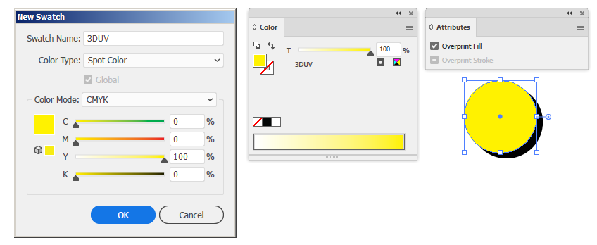
    The final layer of printing is 3D-UV, which is a clear and shiny raised finish.  In your artwork create a custom spot colour named “3DUV”.  Objects to be 3D-UV should be filled the custom spot colour 100%, and set to “overprint”, so that the colours in the layer underneath are not blocked out.

    3D-UV should be kept clear from trim and fold lines, and is best used in large/bold shapes.  Fineprint 3D-UV can lose some detail in it’s shape.

Die Cuts2018-12-11T15:01:08+08:00

Die Cuts

Follow these special instructions for setting up artwork for custom die-cut products. Browse Premium Business Cards.

  • Die Line

    A die line is not required in your artwork if you are ordering a standard shape, such as business cards with square corners, or 4 x round corners at 3mm radius.

    Standard rectangle shapes require a die cut line. Simply change the document/canvas size of your artwork to the custom rectangle size.

  • Vector Artwork

    We need a PDF artwork file to create a new die, no larger than 90x55mm.  Your PDF artwork may contain both your artwork for printing (including vector and bitmaps), and the line for your die-cut, which must be a vector line.

  • Custom Die Line

    To make the shape of your die-cut, draw a vector line around the edge. Give the die line a stroke weight of 1pt or less, and a custom spot colour called “Die Cut” so that it does not print.  If there are several shapes that form the die line, combine them in a compound path.

  • Simple Shapes

    Keep your die-cut shape relatively simple, and avoid complex and detailed shapes.  Ensure that every part of your printing is attached to the rest of the printing, unless you want that part to fall off.  Keep in mind how practical your custom shape will be, and if jagged edges will cause damage to your printing if it catches on other objects.

  • Registration

    Keep in mind that all trimming (including die-cuts) can shift up to 1mm from your intended position.  Use bleeds and margins so that if your bleed line does shift slightly, your design will still work.

  • Flip the back side

    Remember that the back side of your business cards will have the reverse shape to the front side.  This is particularly important if your die-cut shape is asymmetrical.  We don’t need a die line on the back side, but you do need to place your artwork in the appropriate position.

Digital Braille2021-09-09T11:38:34+08:00

Digital Braille

Follow these special instructions for setting up artwork for Digital Braille.

  • Braille Dots

    • Braille dots must be vector graphics, not pixel images.
    • Braille dots to be filled with a spot colour named “Braille”.  These dots will print as transparent 3D-UV.
    • Braille dots must be on the top layer of your artwork, set to overprint.
    • Recommended dot size for Digital Braille is approx 1.6mm in diameter.
    • Braille dots must be kept clear from cut or crease lines.
    • You may also print CMYK dots under the 3D-UV, if you want the dots to appear more visible.
  • Print Specs

    • Artwork must be CMYK, not RGB.
    • Images must be 300dpi and CMYK.
    • Add 3mm bleed on each side of the artboard.
    • Keep a 3mm internal margin on each side.
  • PDF setup

    • 1 x PDF to be supplied per job number.
    • PDF page 1 is the front, page 2 is the reverse side.
    • For multiple kinds, provide 1 x PDF with all pages combined.  eg, Front, Back, Front, Back etc.
  • Braille Language

    • Braille is a language with it’s own grammar and syntax, including uppercase and numeral identifier characters. View our Braille alphabet chart.
    • Braille must be sized and spaced appropriately for the reader’s fingers to “read” clearly. Rather than condensing or shrinking braille to fit limited space, consider prioritising or abbreviating content.
    • You may need to do some research online or consult a braille language expert if in doubt.
Spot 3D-UV2018-12-11T14:51:14+08:00

3D-UV Spot Gloss

Follow these special instructions for setting up artwork that requires our 3D-UV spot gloss. Browse 3D-UV products.

  • Vector Artwork

    Spot UV and 3D-UV gloss is best created as vector artwork, in an application such as Adobe Illustrator. If you only have an image such as a JPG or PNG, send it to us for a quote to get it converted to vector artwork.

  • Custom Spot Colour

    Create a custom spot colour named “Spot UV” or “3DUV”, and fill objects that are to be printed as the UV Gloss with the custom spot colour.  The colour used on screen can be any colour, however the final print will appear as a transparent gloss.

  • Overprint

    To print UV Gloss on top of your CMYK artwork, you will need a top layer of artwork using the custom spot colour you just created (see previous step).

    Ensure that the top-layer objects filled with the spot colour are set to “OVERPRINT”.  In Adobe Illustrator, tick the box in the “Attributes” palette to set an object to overprint, which will ensure the CMYK artwork underneath will also print. Failing to select overprint for the top UV Gloss layer will result in plain white underneath.

  • Trimming & Folding UV Gloss

    Spot UV (Flat UV) can be trimmed and folded, and therefore can extend to the edge of the document, and into the bleed area.

    3D-UV does not trim or fold well, and therefore should be kept away from the trim line, or printed only in thin lines or dots on the trim line.  Block areas of 3D-UV are fine, however when trimmed it can become detached from the stock.

  • Transparency

    Keep Spot UV and 3D-UV objects at 100% opacity and 100% strength. Do not make UV  objects transparent or diluted in the colour palette.

    If you want to “thin” out the appearance of UV Gloss, consider using dots or lines of solid UV.  Variations of CMYK printing underneath the UV Gloss will also create different effects of how visible the UV Gloss is.

  • Fineprint

    Spot UV and especially 3D-UV will not print as detailed as regular colour ink.  Keep this in mind when adding UV to small fine-print and fine detailed graphics.

Booklets & Magazines2021-08-09T10:51:50+08:00

Booklets & Magazines

Follow these special instructions for setting up artwork for multiple-page publications.

  • Self-Cover Booklets

    A self-cover booklet uses the same stock throughout, including the cover. Supply your artwork in pages (not spreads).  An eight-page booklet requires an eight-page PDF, including the covers.

  • Plus-Cover Booklets

    A plus-cover booklet uses a different stock for the cover and the inside pages.

    Supply 1 x PDF for the cover, and 1 x PDF for the inside pages.

    The cover is typically 4 printed pages (4pp), and can be supplied as either a four seperate pages, or two spread pages.  Please ensure your artwork for the cover allows enough extra space for the booklet spine, if applicable.

  • PDF

    Please supply a single PDF artwork file for your booklet, and not separate files for separate pages. Do not supply us with an InDesign artwork file, as they often have missing links and fonts.  Export your booklet as a print-ready PDF.

  • Bleeds

    3mm bleeds are required on each side of each page, but not between two pages that share a double-spread.

    Booklets  are best designed in Adobe InDesign. See our INDT booklet templates here.

  • Spine Size

    Booklets bound with “Saddle Stitching” (staples) generally do not have a spine.

    Booklets with “Perfect Binding” have a spine between the front and back cover, which means the  artwork for the cover needs to allow for this extra space. Below is a guide for spine sizes, using 150gsm pages and a 350gsm cover:

    • 24PP – 2mm spine
    • 30pp – 3mm spine
    • 48pp – 4mm spine
    • 66pp – 5mm spine
    • 82pp – 6mm spine
NCR Invoice Books2018-12-11T14:43:36+08:00

NCR Invoice Books

Follow these special instructions for setting up artwork for NCR (No Carbon Required) Invoice, Quote and Receipt Books. Browse NCR Products.

  • Vector Artwork

    NCR artwork is best created as vector artwork, in an application such as Adobe Illustrator.  Document editors such as Microsoft Word, Apple Pages or Google Docs are also suitable to create the artwork, as long as you can save your final artwork as a PDF.

  • Black Ink

    The cheapest way to print NCR books is a single colour black ink or greyscale.  The numbering will always be printed in red ink.

  • Colour

    Full colour and Pantone spot colours are also available for an extra fee.  Full colour is printed in CMYK.  Pantone spot colours are best setup in Adobe Illustrator, and are priced per spot colour used.

  • Numbering

    Choose a place in your artwork where the red numbering will be placed, and show this to us in a separate supporting document when supplying your artwork.  Please do NOT include the red numbering in your final PDF artwork.

  • Perforation Margin

    Standard pricing for NCR Books comes with one single perforation, usually at the top or side of the page.  Allow a 15mm margin on the side where the perforation will be. You may choose to show the location of the perforation in a supporting document when supplying your artwork. Please do NOT include a perforation line in your final PDF artwork.

  • Printing on the reverse side

    You may want to print extra information on the reverse side of a page, such as “terms & conditions”. Supply an extra PDF page for this, keeping in mind:

    • NCR paper is thin and transparent, so use lighter ink such as grey on the reverse side.
    • If the perforation on the front of the page is on the side (eg left side), then it will be on the opposite side on the reverse side (eg right side). Remember to leave a 15mm margin for the perforation on the correct side. A top-perforation will remain on the top side for both sides of each page.
    • It is common practice to print on the reverse side of the first copy only, to give to the customer.

Where does the trade buy printing in Australia?

Right here, and so should your business!
Join us for the best value and advice in Australia, and let’s get printing!

Go to Top